


It might seem like a small detail, but choosing the best font for your resume can make the difference between getting noticed or getting passed over.
Not only does your font need to be easy on the eyes of hiring managers, but it also has to be readable by applicant tracking systems (ATS). This is the software most companies use to filter and organize resumes.
If your font is difficult to read, an ATS may not interpret your information correctly, which could make your resume harder to find.
This guide will help you choose a resume font that works for both humans and technology.
What font is best for a resume in 2026?
Jobscan recently tested some of the top applicant tracking systems (ATS). We found that the following fonts are the best choices for your resume.
- Calibri
- Cambria
- Georgia
- Helvetica
- Arial
- Times New Roman
- Garamond
- Palatino
- Tahoma
- Verdana
What’s the difference between serif and sans serif?
Fonts fall into two main categories:
- Serif fonts have small decorative lines or “feet” at the ends of their letters, giving them a classic and traditional feel. These subtle details can improve readability, especially in print.
- Sans serif fonts lack these embellishments, creating a clean, modern look that’s often preferred for on-screen reading.
No matter which font or size you choose, always test your resume by printing it out and viewing it on different devices to ensure it looks professional across all formats.

The top 10 best fonts for your resume
1. Calibri font
Calibri is a modern sans-serif typeface that became the default font for Microsoft Word in 2007. Its clean design, combined with rounded edges and a warm appearance, makes it highly legible both on screen and in print.

Pros: Calibri’s sleek design gives documents a contemporary and professional appearance. It’s easy to read on both digital displays and in print.
Cons: Being the default font for Microsoft Word, Calibri can be perceived as generic or lacking originality.
Here’s what the Calibri font looks like on a resume:

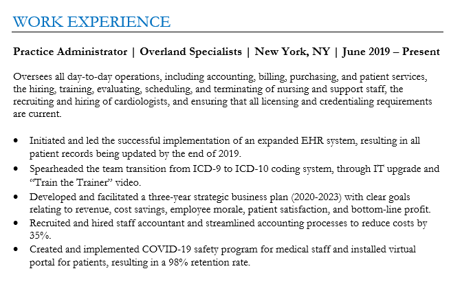
2. Cambria font
Introduced with Microsoft Office in 2007, Cambria was specifically optimized for on-screen reading and to look elegant when printed at small sizes.

Pros: Cambria strikes a balance between contemporary and classic. This makes it suitable for a wide range of professional documents, both in print and digital.
Cons: Some might find Cambria too neutral or generic for creative or design-focused projects.
Here’s what the Cambria font looks like on a resume:

3. Georgia font
Created in 1993 for Microsoft Corporation, Georgia is a serif typeface designed to be read on computer screens. Georgia’s versatility and readability have made it a staple for web content, articles, and professional documents.

Pros: Georgia’s clear character design ensures that it remains readable even at smaller sizes, both on screen and in print.
Cons: Given its popularity and widespread use, especially on the web, Georgia might be perceived as a standard or generic choice.
Here’s what the Georgia font looks like on a resume:

4. Helvetica font
Helvetica is so popular that on its 50th anniversary, a documentary film was released chronicling the font’s use in modern design. It has a reputation for representing corporate branding, making it a great choice for corporate candidates.

Pros: As one of the most iconic fonts, Helvetica has a timeless quality that remains modern and relevant, even decades after its creation.
Cons: While Helvetica is a standard font on Macs, Microsoft Windows does not include it. Instead, Microsoft provides Arial, which is similar to Helvetica.
Here’s what the Helvetica font looks like on a resume:

5. Arial font
Commissioned by Microsoft, Arial was created as an alternative to the popular Helvetica font. Characterized by its clean and modern design, Arial has become one of the most widely used fonts for both print and digital media.

Pros: As a default font in Microsoft Windows, Arial is widely recognized and compatible across many platforms and devices.
Cons: While Arial was designed as an alternative to Helvetica, some designers believe it lacks the subtle design nuances that give Helvetica its iconic status.
Here’s what the Arial font looks like on a resume:

6. Times New Roman font
Designed in 1931 for The Times of London, Times New Roman became a standard for books and academic papers. However, Times New Roman is not the best font for screens. Since most resumes are viewed on screens today, a font like Calibri, Arial, or Georgia may be a better choice.

Pros: Times New Roman allows for a good amount of text to fit on a page without compromising legibility.
Cons: While it’s optimized for print, Times New Roman might not always be the best choice for digital platforms, where sans-serif fonts often prevail for clarity and legibility.
Here’s what the Times New Roman font looks like on a resume:

7. Garamond font
Garamond is a classic serif typeface designed in the 16th century. It remains a popular choice for book printing, branding, and a wide range of print materials.

Pros: Garamond is a space efficient font. It uses less horizontal space compared to other fonts.
Cons: While Garamond is optimized for print, it might not always be the best choice for digital platforms where sans-serif fonts are often favored for clarity and legibility.
Here’s what the Garamond font looks like on a resume:
8. Palatino font
Designed in the 1940s, Palatino has a classic and timeless quality that evokes a sense of tradition and sophistication. It works as a great alternative to Times New Roman for those who have grown tired of the more generic font.

Pros: The Palatino font works well in both print and digital media. It’s commonly used in books, magazines, and websites.
Cons: Palatino’s bold version might not have the same visual impact as other typefaces.
Here’s what the Palatino font looks like on a resume:

9. Tahoma font
Tahoma is a sans-serif typeface designed in 1994. It was specifically created to be legible on computer screens. Tahoma has a technical feel to it and is a great option for engineers.

Pros: Tahoma remains clear and readable even when used at small font sizes.
Cons: Tahoma’s frequent use in Microsoft’s products and operating systems can make it feel overused and dated.
Here’s what the Tahoma font looks like on a resume:

10. Verdana font
Verdana is another Microsoft commissioned sans-serif font. It was developed specifically for improved legibility on digital screens, making it a safe choice for resumes.

Pros: Verdana’s design versatility allows it to be effective in both on-screen and print contexts.
Cons: Verdana’s relatively generous spacing can sometimes lead to more space-consuming layouts when compared to other typefaces.
Here’s what the Verdana font looks like on a resume:

Use a resume scanner to check your formatting
Choosing the right font—and formatting your resume correctly—can make a big difference.
If your resume isn’t formatted properly, an ATS may misread it, making it harder for recruiters to find.
To avoid this risk, use Jobscan’s free ATS resume scanner. It checks your entire resume too see if it’s ATS-friendly. You’ll get a report that tells you what you need to adjust to make your resume searchable.
- Upload your resume file.
- Paste the job description for a job you want to apply for.
- Review your resume report to see what adjustments you need to make.
- Follow the advice to optimize your resume.
- Apply using your now ATS-friendly resume.
If your formatting is not ATS-friendly use an ATS-friendly resume template with fonts and formatting already handled.
How to choose a resume font for your industry
Your resume font should match your industry and the job you’re going for.
For law, finance, and corporate jobs
Choose classic, professional fonts that convey credibility.
- Times New Roman – Traditional and widely accepted.
- Cambria – Formal yet modern.
- Georgia – Readable in both print and digital formats.
For business, marketing, and tech jobs
Choose modern sans-serif fonts that balance professionalism and readability.
- Calibri – Clean, contemporary, and widely used.
- Arial – Simple and effective.
- Tahoma – A polished, slightly technical feel.
For marketing, design, and media jobs
Choose stylish yet readable fonts that reflect creativity.
- Garamond – Elegant and sophisticated.
- Palatino – A refined serif font with a creative edge.
- Georgia – Classic yet modern, great for digital and print.
For engineering, IT, and data roles
Choose precise, structured fonts for clarity.
- Verdana – Clear and widely spaced.
- Tahoma – Crisp and professional.
- Helvetica – Sleek and corporate-friendly.
How to choose the right font size
Font size matters just as much as font choice. Using the right size ensures your resume is easy to read for both hiring managers and applicant tracking systems (ATS). Pair the right size with proper resume margins so the page has room to breathe.
- Body text: Stick to 10–12 pt for clarity and readability.
- Headings: Use 14–16 pt to make section titles stand out.
- Your name: Can be slightly larger, around 18–22 pt, to grab attention.
PRO TIP: Avoid making your font too small to fit more content. If your resume feels cramped, focus on concise wording instead of shrinking text.
And if you are fighting for space, check how long your resume should be before you shrink anything.
How to format your resume properly
Proper formatting ensures your resume is easy to read for both hiring managers and applicant tracking systems (ATS). Follow these eight tips to make sure your resume is structured correctly.
1. Use a hybrid resume format
There are three basic resume formats. Here’s a brief description of each:
- Chronological – This is the most traditional format, where your work experience is listed in reverse chronological order.
- Hybrid – This format features skills at the top, followed by a reverse chronological work history.
- Functional – Instead of focusing on work history, this format emphasizes skills.
We recommend the hybrid resume format because most recruiters want to see your skills before your work experience, not after.
Try to avoid the functional resume format. Hiring managers don’t care for it because they want to see your work history. It might also cause problems for an ATS.
Whichever format you use, try to add a resume summary. This quickly tells hiring managers what you can bring to the table in a new role.
2. Avoid non-standard fonts
When selecting a font for an ATS-friendly resume, avoid script, cursive, and decorative fonts.
Non-standard fonts like these can be challenging for an ATS to read and may appear unprofessional to a hiring manager.
3. Avoid graphics, logos, and other visual elements
While fancy visual elements can enhance the aesthetic appeal of your resume for human readers, they can sometimes confuse the ATS.
ATS are designed to read text, not images, which is one more reason to think twice before putting a picture on your resume.
4. Use bullet points
Bullet points break down complex information into digestible chunks, making it easier for both ATS and human readers to scan and understand your qualifications and achievements.
However, it’s essential to use simple bullet symbols, like circles or dashes. Some ATS might struggle with more intricate symbols.
PRO TIP: Always use strong action verbs to begin each bullet point on your resume.
5. Be consistent in your date formatting
Make sure that the dates of your employment and education sections are consistently formatted. Here are three examples of how to format your dates:
- January 2020 – December 2022
- Jan 2020 – Dec 2022
- 01/2020 – 12/2022
Whichever format you choose, be consistent throughout your resume. Also, don’t only include the year. Some ATS are designed to look for more specific date formats.
6. Avoid unclear abbreviations and acronyms
ATS are designed to scan resumes for specific keywords. If you use an abbreviation or acronym that the system isn’t programmed to recognize, it might overlook crucial information about your qualifications.
If you do choose to use an abbreviation or acronym, introduce it by first writing out the full term followed by the abbreviation in parentheses. For example, “Certified Public Accountant (CPA).”
7. Tailor each resume to the specific job you’re applying for
Many job seekers make the mistake of using the same resume for every application. In today’s job market, you really need to tailor each resume.
This is because recruiters search the ATS database by typing keywords that appear in the job description. If your resume doesn’t contain those keywords, it may be overlooked.
According to a Jobscan State of the Job Search survey, over 99.7% of recruiters said they use filters when searching for candidates in an ATS. What are they filtering for?
- 76.4% filter by skills
- 55.3% by job title
- 50.6% by certifications
- 44% by years of experience
Tailoring your resume takes extra effort but leads to more interviews. Jobscan’s resume scanner makes this process faster and easier.
Just paste your resume and the job description into the scanner and it will give you a score that shows how closely your resume matches the job requirements.
You’ll also see exactly which keywords you should include on your resume to increase your score.
Key takeaways
- Use ATS-friendly fonts like Calibri, Cambria, Georgia, Helvetica, Arial, and Times New Roman.
- Serif fonts work well in print, while sans-serif fonts are best for digital resumes.
- Avoid decorative fonts like script or cursive—they can confuse ATS.
- Format your resume properly with bullet points, clear headings, and consistent date formatting.
- Tailor your resume by using keywords from the job description to improve ATS ranking.
- Use Jobscan’s Resume Builder to ensure ATS-friendly formatting and font choices automatically.


